The colour of architecture
Xavier Bordils
| El
color de la arquitectura
The colour of architecture |
||
|
Xavier Bordils |
| “El
color es la identidad. Esta idea no es nueva, pero adquiere toda su
fuerza y su significado cuando el conjunto de los países europeos se
unen. Unión que no significa uniformidad. Más bien al contrario, ya que
las numerosas confrontaciones que suscitan los intercambios y el diálogo
europeo frente a la globalización” nos obligan a concienciarnos más aún
de las riquezas propias de cada país de la Comunidad. Entre estas riquezas, el patrimonio natural o el arquitectónico -paisaje de la naturaleza y paisajes construidos- son algunos de los factores que cuentan como valores de atracción específicos de cada lugar, de la geografía, de la tipología cultural y social de un país, de una región, de una ciudad o de un pueblo”. |
“Colour is identity. This is not a new
idea, but its full force and significance become apparent as the countries
of Europe unite. Union does not mean uniformity. Rather the reverse, as
the numerous confrontations in European trade and European dialogue when
faced by ‘globalisation’ force us to become even more aware of the
riches of each of the European Union countries. |
 |
 |
 |
|
 |
 |
Esto escribía Jean Philippe LENCLOS en el prefacio al libro “El Color en la arquitectura tradicional Valenciana” del que soy coautor junto a Susi Seva, reeditado por nosotros mismos en 1999: (después de una primera edición de Bancaja y el Colegio Oficial de arquitectos de la Comunidad Valenciana). En el transcurso de los viajes por la Comunidad Valenciana para la preparación de dicho libro, hemos observado como las viejas casas, a menudo modestas, incluso pobres, cuya paleta de colores maravillosa, dentro de su sobriedad, es el fruto de viejos hábitos y costumbres, o de creación espontánea, no son, sin embargo, motivo de orgullo para sus habitantes, que preferirían una vivienda “moderna” más representativa del status social que quieren aparentar, manifestándose hoy una fuerte tendencia a utilizar en gran medida el blanco y tonos neutros. Este es un cambio que constituye, a nuestro modo de ver, una “banalización” y un empobrecimiento del patrimonio. Podemos constatar hoy que en numerosos países de Europa, los poderes públicos han tomado conciencia de la importancia del color en el paisaje, que el color propio pertenece al patrimonio cultural de la ciudad o de la región. Esta concienciación ha conducido a la puesta en vigor de reglamentos locales para la promoción de la calidad arquitectónica, definiendo las paletas de color destinadas a la construcción de nuevas viviendas y la rehabilitación de las viejas. Por ejemplo, en Francia, estos reglamentos datan de los años 70. EL
COLOR COMO HERRAMIENTA DEL PROYECTISTA Pero es un dato que corresponde a la percepción colectiva de ese elemento cultural que es la sensibilidad estética de un pueblo, tal como ha sido aplicada por varias generaciones y tal como lo percibimos hoy nosotros, configurando de alguna forma nuestro gusto o nuestro condicionamiento, implantado dentro de un contexto más general: Por ejemplo, La Comunidad Valenciana tiene sus características propias de color y materiales que a su vez tienen muchos elementos en común con la cultura cromática mediterránea más amplia, en la está inmersa. También el arquitecto, al proyectar puede utilizar el color como una dimensión añadida, a veces cuando no puede modificar volúmenes puede aportar mejoras a la apariencia gracias a contrastes de pigmentos. Así, el color es un elemento de percepción que junto con otros elementos como las sombras, nos permite leer los volúmenes, las formas. Incluso puede considerarse el color como forma, pues puede hacernos percibir cambios de formas donde no existen (recordemos el “trompe l’oeil” que permite ver ventanas donde no las hay). Puede así el autor del proyecto alejar o acercar visualmente ciertos elementos, subrayar ciertas formas “manipulando” los contrastes de color. EL
COLOR ES IDENTIDAD CÓDIGOS
CROMÁTICOS Los
edificios públicos, o singulares que sirven de punto de referencia, en la
lectura de la aglomeración urbana, son a menudo, tradicionalmente, de
piedra local, o enlucidos con morteros miméticos realizados con las
tierras del entorno, de colores propios y diferentes según la comarca, en
los casos de las ciudades históricas. Sin embargo en los núcleos
modernos estos edificios-signos (me niego a llamarles “emblemáticos”
como diría cualquier periodista que se precie) nos muestran actualmente
colores “internacionales” ocasionados por muros-cortina de aluminio,
acero y vidrio de colores, o espejos que, incluso, reflejan los colores
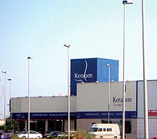
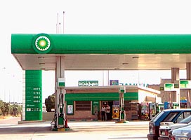
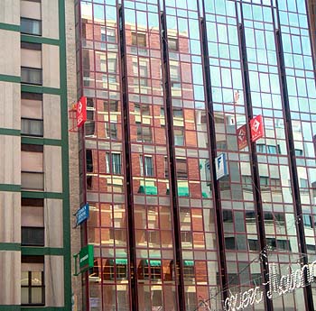
tradicionales del entorno. También el color es identidad industrial, perceptible en los colores corporativos de las grandes redes de edificios de servicio como centros comerciales, gasolineras, restaurantes, bancos, y los, hoy tan de moda, parques temáticos. Aunque en el caso del color identidadcomercial lo más habitual es que sólo influya en la lectura peatonal desde el interior de las calles, raros son los edificios cuyo color corporativo cubra todo el edificio desde la planta baja a la azotea, es más habitual que se limite a la planta baja, o hasta el entresuelo. Y no hablemos de los “totems” señaléticos de los centros comerciales, gasolineras o otros restaurantes de comida rápida que pululan por las periferias de las ciudades. Y sobre todo, el color es identidad individual y el mejor medio para contribuir a que el ciudadano participe en la aventura creativa de su casa y de su pueblo. EL
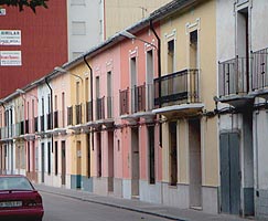
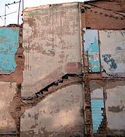
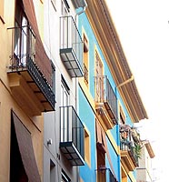
COLOR EN LA ARQUITECTURA COMO CREACIÓN COLECTIVA Este proceso de “rediseño” de la vivienda se realiza en dos direcciones: por una parte la integración en la del pueblo, de la comarca (mimetismo con el entorno cultural) y por otra la individualización del espacio de vida. En las viviendas, se busca la discreción y la diferenciación con el vecino, el color tiene como finalidad delimitar la propiedad, en fachadas de casas yuxtapuestas y procurar limpieza y estética utilizando colores discretos (azules y ocres). A veces, estos mismos colores se prolongan en el interior de la propia vivienda. Los zócalos, que permiten disimular las manchas de humedad procurando limpieza e higiene, son más oscuros y siguen en pintura el mimetismo de los morteros o piedra local. Ensanchando visualmente la angostura de la calles, al coincidir o por lo menos aproximarse el tono de los zócalos al de las aceras y calzadas. También los colores de los materiales: Madera, piedra, tejas y los azulejos policromos intervienen en la matización unitaria de las diferentes pueblos, aglomeraciones urbanas y comarcas. Dentro de un mismo pueblo, los barrios más ricos utilizan colores más armónicos (pasteles) y más variados y los barrios más pobres utilizan menos colores, más contrastados para sus adornos, sobre fondos de fachadas blancas. EL
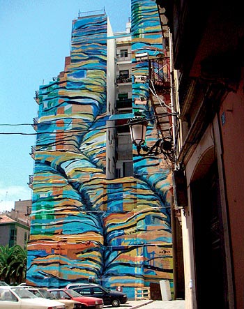
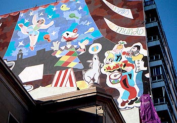
COLOR, ANIMACIÓN URBANA Sus autores los “tagers” han convertido las ciudades en museos abiertos llenos de composiciones cromáticas que contrastan con la “limpieza”, por no decir frialdad, de cierta arquitectura impersonal. Al socaire de este movimiento, no siempre bien visto por los ciudadanos, se han desarrollado por parte de los poderes públicos locales, proyectos de grandes murales encargados a artistas diversos, para animar grandes lienzos de muro que habrían quedado ciegos o medianeras demasiado altas. De esta forma, el color espontáneo que anima las ciudades aportado por sus habitantes, escapa al designio inicial de los proyectistasurbanistas, como el color en las viviendas las modifica con el tiempo, sin el control del arquitecto. EL
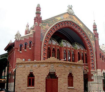
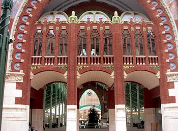
COLOR DE LA ARQUITECTURA EN LA HISTORIA Históricamente, en los edificios públicos se ha realzado siempre el color natural de los materiales mediante pinturas e incrustaciones de otros materiales: Oro, bronce, esmaltes, mosaicos, etc. buscando un efecto de contraste con la masa del edificio, subrayando entradas, pórticos, para ser identificados desde fuera, como puntos de referencia en la ciudad. Ya los sumerios, inventores del ladrillo de cerámica de colores miméticos con el entorno, utilizaron en sus ciudades de Mesopotamia, como Ur, capiteles esmaltados, estatuas policromas con dominantes azules verdes y turquesas para contrastar con los colores del ladrillo, convirtiendo así sus templos y palacios en hitos importantes que dominan y “nucleízan” la ciudad. Los egipcios, además de elegir cuidadosamente piedras y granitos negros y de otros colores, que combinaban entre sí, realzaban con pinturas al fresco, frisos, capiteles, etc. con gran variedad de color. Griegos y romanos utilizaron el mármol pintado y con incrustaciones de bronces dorados, mosaicos, policromos y dorados. Nuestra visión actual del Partenón blanco marmóreo no tiene nada que ver con la sensación rica en color que percibían los contemporáneos de Fidias, que reconocían sus templos por los colores exteriores, rojos, ocres terracotas y dorados, visibles desde lejos, en contraste con el efecto blanqueante del sol sobre el conjunto de la ciudad. La cultura islámica dejó durante la Edad Media una gran huella en nuestras comarcas, con sus alminares y mezquitas, ornamentados con mosaicos y alicatados con dominantes azules, turquesas y dorados, que son sin duda, los precedentes directos de los azulejos y de las cúpulas de tejas vidriadas (“medias naranjas”), de nuestros pueblos. También en la Edad Media, las catedrales góticas, policromas en su interior, (como la Sainte Chapelle de París), lucían en el exterior, unos pórticos ricamente coloreados, con tímpanos representando a Cristo en Majestad, a la Virgen, en contraste con el color dominante de la piedra, como para señalizar los accesos. Así lo podemos apreciar en los vestigios de colores que adornaban la puerta “deis Apóstols” de la basílica de Morella, entre otros ejemplos góticos de nuestras tierras. En el Renacimiento se utilizan, sobre todo en Toscana, piedras de colores diversos combinando composiciones que realzan el dibujo arquitectónico, pero en general se acentúa la nobleza del material, armonizando gamas de colores poco contrastados en detrimento de una gran diversidad cromática. Con el manierismo y el “trompe l’oeil” barroco, se vuelve a recurrir ala pintura para aportar profusión de color, con estucos, falsos mármoles, dorados y otros adornos de los que desgraciadamente, pocas huellas de pinturas exteriores muy deterioradas quedan hoy aún en algunas fachadas de nuestras iglesias. También, como reacción al academicismo de la arquitectura neoclásica, que consideraba erróneamente el monocromatismo como una virtud de la Grecia antigua, se vuelve a utilizar la pintura y el mosaico de manera nueva y atrevida en el siglo XIX. Y en nuestro siglo XX, después del modernismo, se inicia lo que puede parecer una ruptura cromática, con la utilización, en edificios singulares, de materiales como el vidrio, el aluminio, el acero, el plástico, el hormigón etc., sin conexión cultural con los materiales locales, aunque puede también constituir un enriquecimiento de la paleta tradicional y una respuesta a la permanente cuestión de códigos de contraste y mimetismo. Contraste acentuado por los colores de los “graftti” urbanos. La vivienda rural, más enraizada en su identidad cultural local, puede servirnos de muestra para la arquitectura-hábitat, mientras los nuevos hitos que ya no son los templos, sino los hipermercados, las gasolineras, los muros publicitarios y... las “ex torres gemelas”, nos aparecerán “internacionales”, cada vez más contrastados con su entorno natural. |
As we travelled around the Valencia region preparing this book, we discovered that the owners are not proud of their old houses, which are often modest, even poor, but range through a sober yet marvellous pallete of colours, the result of old habits and customs or of spontaneous creativity. They would rather live in “modern” housing, as a better reflection of the social status they wish to display, and there is a strong tendency nowadays to use mostly white and neutral tones. In our opinion, this is a change that ‘trivialises’ and impoverishes our heritage. However, in many European countries we find that the authorities have become aware of the importance of colour in the landscape, of the local colour being part of the cultural heritage of the city, town or region. This awareness has led to the introduction of local regulations to promote architectural quality that define the range of colours to be used when building new houses or refurbishing old ones. In France, for example, such regulations date back to the 1970s. COLOUR
AS A DESIGN TOOL However, it is a datum that is part of the collective perception of a cultural element, the aesthetic sensitivity of a people, as applied through several generations and as we perceive it now. To a certain extent, rooted within a more general context, it shapes our tastes or our conditioning. For example, the Valencia region possesses its own characteristic colours and materials. These, in turn, share many features of the wider Mediterranean chromatic culture in which this region is embedded. Equally, the architect can use colour as an added dimension of the design. On occasion the volumes cannot be modified but their appearance can be improved through the use of contrasting pigments. Used in this way, colour is an element of perception that can be combined with others such as shadows to allow shapes and volumes to emerge. It is even possible to consider colour as form, since it can make us perceive nonexistent changes in form (remembering the trompe l’oeil that makes us see windows where none exist). The architect can make certain elements seem closer or further away or can emphasise certain shapes by ‘manipulating’ colour contrasts. COLOUR
IS IDENTITY COLOUR
CODES Public buildings or unique buildings that serve as landmarks when interpreting the urban conglomeration are traditionally often built in the local stone or rendered with mortars that are made with and imitate the soil of the surrounding countryside. In the case of historic towns, each has its own colours that differ from district to district. However, in modern town centres these sign buildings (I refuse to call them ‘emblematic’, a word that any self-respecting journalist would use) now display the ‘international’ colours of their curtain walls: aluminium, steel and tinted glass, or one-way glass, which even reflects the traditional colours of the surroundings. Meanwhile, housing employs a more unified pallette of soft colours, providing an almost uniform background that highlights the contrasting landmark buildings. Colour is also industrial identity. This can be seen in the corporate colours of the great chains of service sector buildings such as shopping centres, petrol stations, restaurants, banks and the theme parks that are currently so fashionable. However, commercial identity colours usually only impinge on the view of the pedestrian in the street: the corporate colour of a building rarely covers it entirely from ground level to rooftop, mostly it is confined to the ground floor or reaches as far as the mezzanine. As for the towering ‘totem’ signs of the shopping centres, petrol stations and fast food outlets that swarm all over the outskirts, they are better left unmentioned. Above all, colour is individual identity and is the best way to help the public to take part in the creative adventure of their houses and their towns and villages. COLOUR
IN ARCHITECTURE AS A COLLECTIVE CREATION The process of ‘redesigning’ the home moves in two directions: integration into the collective aesthetics of the town or village and the district (imitation of the cultural surroundings) and individualisation of the living space. Home owners aim for discretion and differentiation from their neighbours. The purpose of colour is to mark the limits of the property on the façades of adjoining buildings and achieve a clean, aesthetic effect through the use of discreet colours (blues and ochres). Sometimes the same colours are carried through into the interior. Plinths and dadoes mask dampness and aid cleanliness and hygiene. They are darker and the paintwork imitates the local stones or mortars. They widen narrow streets visually by having the same hue as the streets and pavements, or a similar one at least. The colour of the materials, wood, stone, roof tiles and multicoloured wall tiles, also plays a part in unifying and differentiating villages, urban conglomerations and districts. Within the same village or town, the wealthier neighbourhoods employ more harmonious and more varied colours (pastels) while the poorer areas use fewer, more contrasting colours on a white background to adorn the façades of their homes. COLOUR
AS URBAN ENLIVENMENT The taggers have turned the cities into open-air museums filled with colour compositions that contrast with the ‘cleanliness’, or coldness, of an impersonal architecture. Spurred by this movement, which is not always viewed kindly by other citizens, local authorities have developed projects for large murals by an assortment of artists to enliven large stretches of blank wall or excessively high party walls. The spontaneous colour provided by the inhabitants that enlivens the cities thus eludes the original intentions of the designers/town planners in the same way as the colour of the houses changes over time, out of the architect’s control. THE
COLOUR OF ARCHITECTURE THROUGH HISTORY In public buildings, throughout history, the natural colour of the materials has always been enhanced by painting or by embedding them with other materials such as gold, bronze, glazes, mosaics, etc. The purpose is to highlight doorways and porticoes and provide a contrast with the bulk of the building so that it can be identified from a distance as a city landmark. In the cities of ancient Mesopotamia such as Ur, the Sumerians (who invented ceramic bricks that imitated the hues of the surrounding areas) were already using glazed capitals and polychrome statues, mainly in blues, greens and turquoises, to contrast with the colours of the bricks and turn their temples and palaces into landmarks that dominated and ‘nucleised’ the city. As well as carefully choosing and combining stones and granites in black and other colours, the Egyptians employed fresco paints to decorate friezes, capitals etc. with a large variety of colours. The Greeks and Romans painted and inlaid marbles with gilt bronze, mosaics, polychrome and gilding. The way we now see the Parthenon, a vision of white marble, is totally unlike the colourful sight seen by the contemporaries of Phidias, who recognised their temples by the red, ochre, terracotta and golden colours of their exteriors, visible from afar, contrasting with the sun-bleached appearance of the rest of the city. During the Middle Ages, the culture of Islam left a considerable mark on this part of Spain. Mosques and minarets decorated with mosaics and tiles, with blue, turquoise and gold as the predominant colours, are undoubtedly the direct forebears of the wall tiles and glazed tile domes (‘half oranges’) of the villages in the Valencia region. Still in the Middle Ages, the Gothic cathedrals had polychrome painting in the interior (as in the Sainte Chapelle in Paris) and, on the exterior, richly coloured porticoes with tympani depicting Christ in Majesty and Our Lady that stood out against the dominant colour of the stone to signal the entrances. Traces of colour still remain on the Apostles’ doorway of the basilica in Morella, to cite only one example from the Gothic period in the Valencia region. During the Renaissance, particularly in Tuscany, different coloured stones were combined in compositions that highlighted the architectural form, although in general the emphasis was placed on the fine materials, harmonising a range of colours with little contrast, rather than chromatic diversity. Mannerism and Baroque trompe l’oeil returned to paint to achieve a profusion of colour, using stucco, fake marble, gold and other adornments. Unfortunately, only a few traces of the exterior paint, in very poor condition, remain on church façades in the Valencia region. As a reaction against the academicism of neo-classical architecture, which erroneously believed monochromatism to have been an ancient Greek virtue, the 20th century returned to paint and mosaics, using them in a new, daring way. Following the Modern Movement, still in the 20th century, came the start of what might seem a chromatic rupture, as individual buildings began to use materials such as glass, aluminium, steel, plastic, concrete etc. that have no cultural connection with the local materials. However, they could equally be considered an enrichment of the traditional pallette and a response to the permanent question of codes of imitation and contrast. The contrast is accentuated by the colours of the graffiti. Homes in rural areas, more rooted in their local cultural identity, can serve as an example of habitat-architecture, while the new landmarks, which are no longer churches but superstores, petrol stations, advertising hoardings, or the ‘ex Twin Towers’, seem ‘international’, in increasing contrast to their natural surroundings. |
     |
|